
Under the creative guidance of VP Greg Johnson, we embarked on a mission to revolutionize the Stitch Fix brand. This wasn’t just a refresh; it was a full-on rebrand, designed to push boundaries and redefine what Stitch Fix could be. To kick off this transformation, I led a small but mighty “tiger team” of in-house creatives and external consultants tasked with creating three distinct “brand territories,” each representing a different vision for Stitch Fix’s future. The challenge? Sell one of these bold new directions to the C-suite.
territory 1: mirror
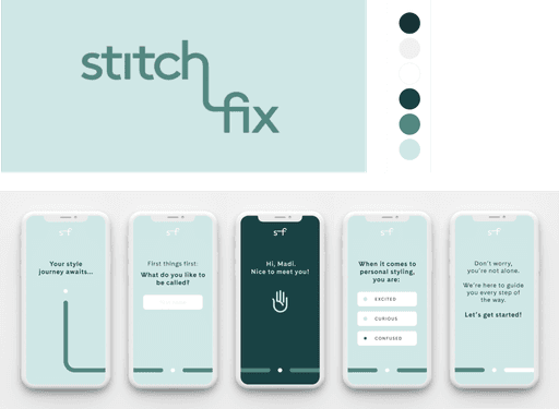
The first territory, Mirror, was the most modest of the three—a gentle evolution that leaned into Stitch Fix’s strength in reflecting each client’s true style. It kept much of the existing design system intact, with subtle updates to keep things feeling fresh. This approach was all about familiarity, ensuring that the brand remained recognizable while embracing a modern edge.
the team
TERRITORY 2: PATH
The second territory, Path, took inspiration from the journeys of our clients. Many had described their style evolution as a personal journey, and we tapped into that sentiment with a visual metaphor of an unwinding road. This direction played with clever motion design to illustrate the ongoing, never-ending exploration of one’s unique style. It was a concept rooted in progress and discovery, perfectly aligning with the stories our clients were already telling us.
the team
territory 3: magnetism
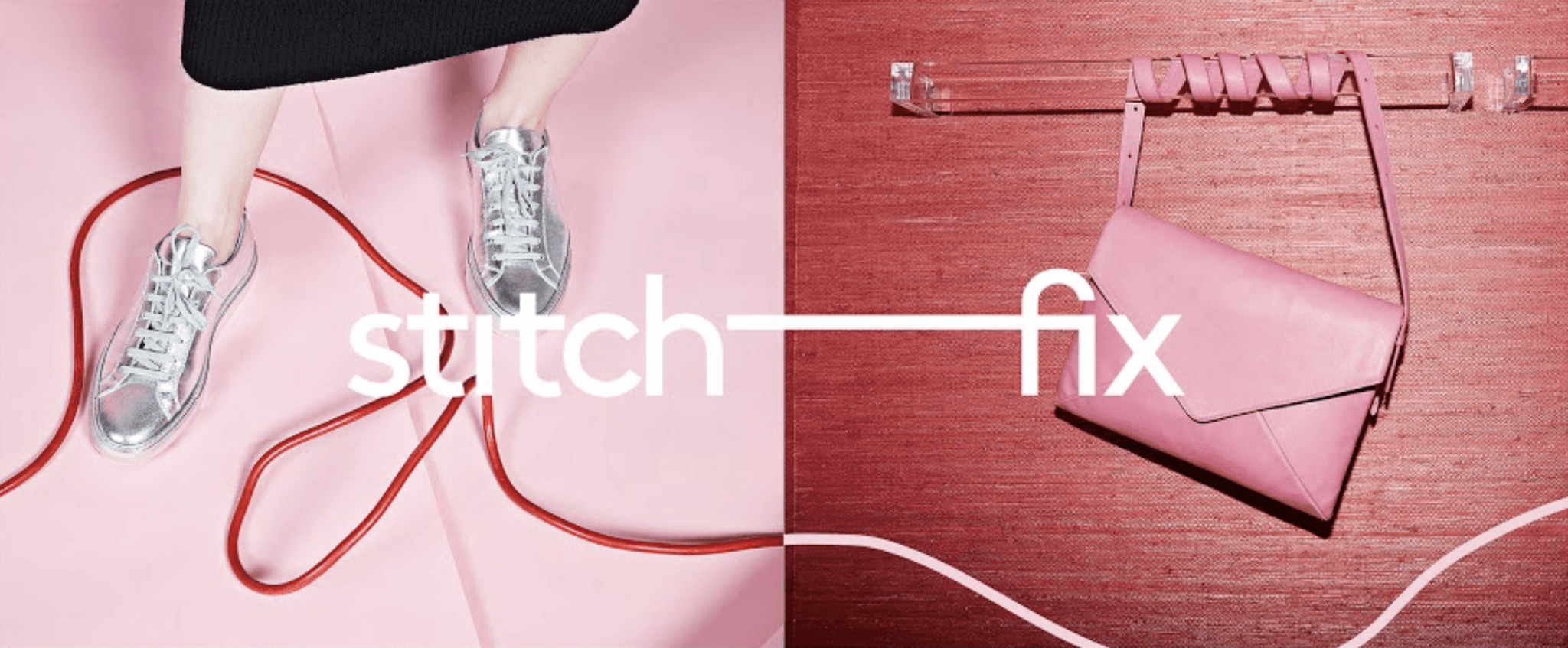
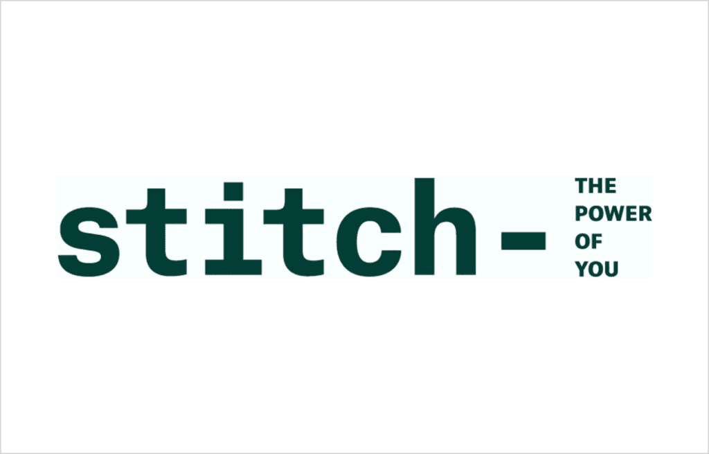
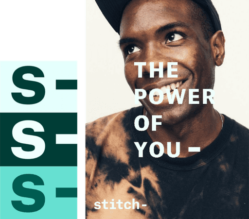
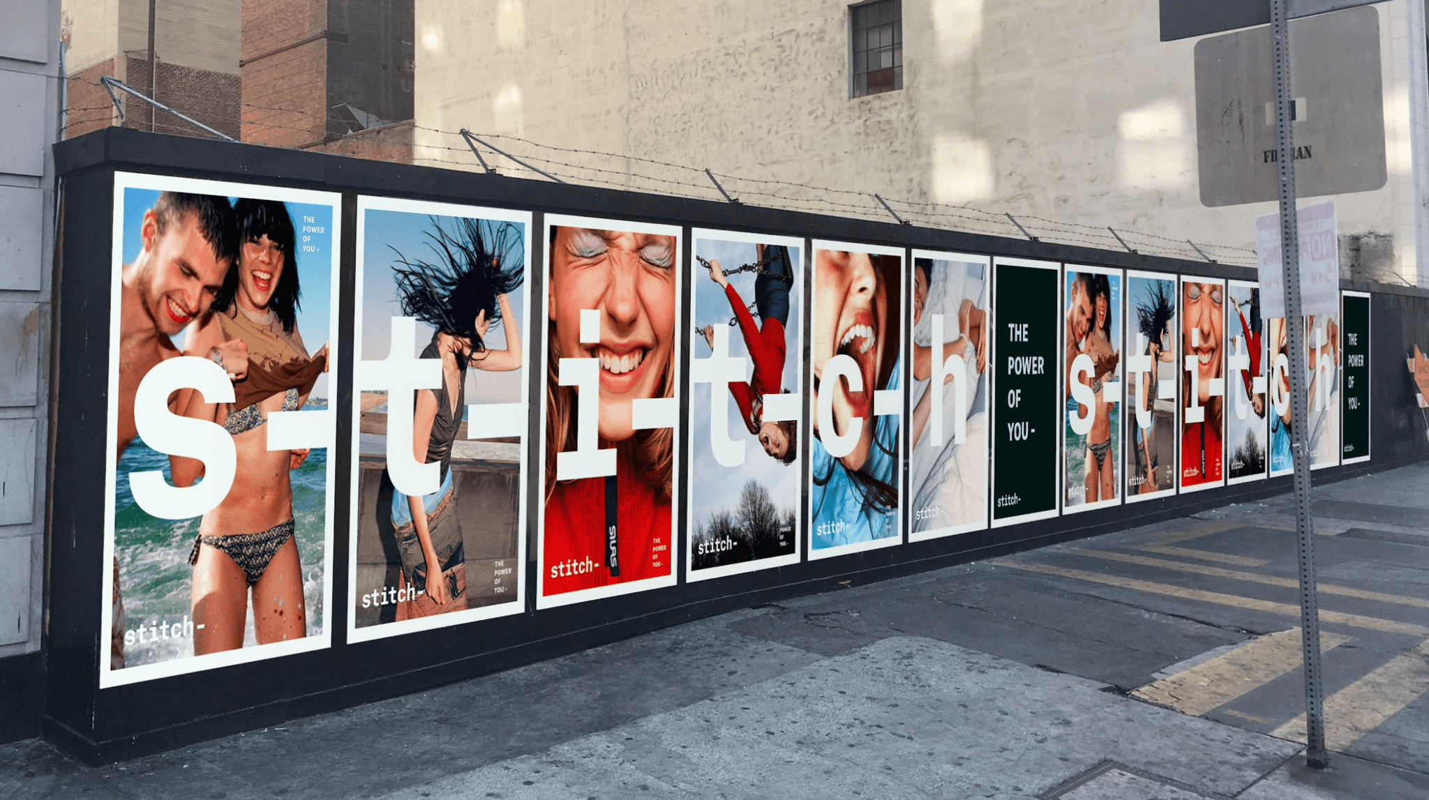
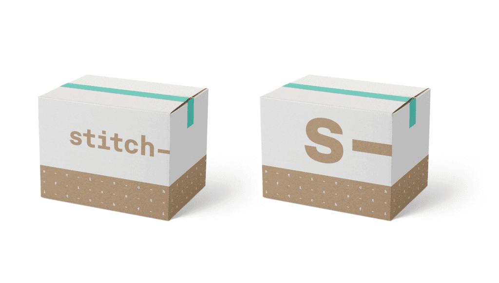
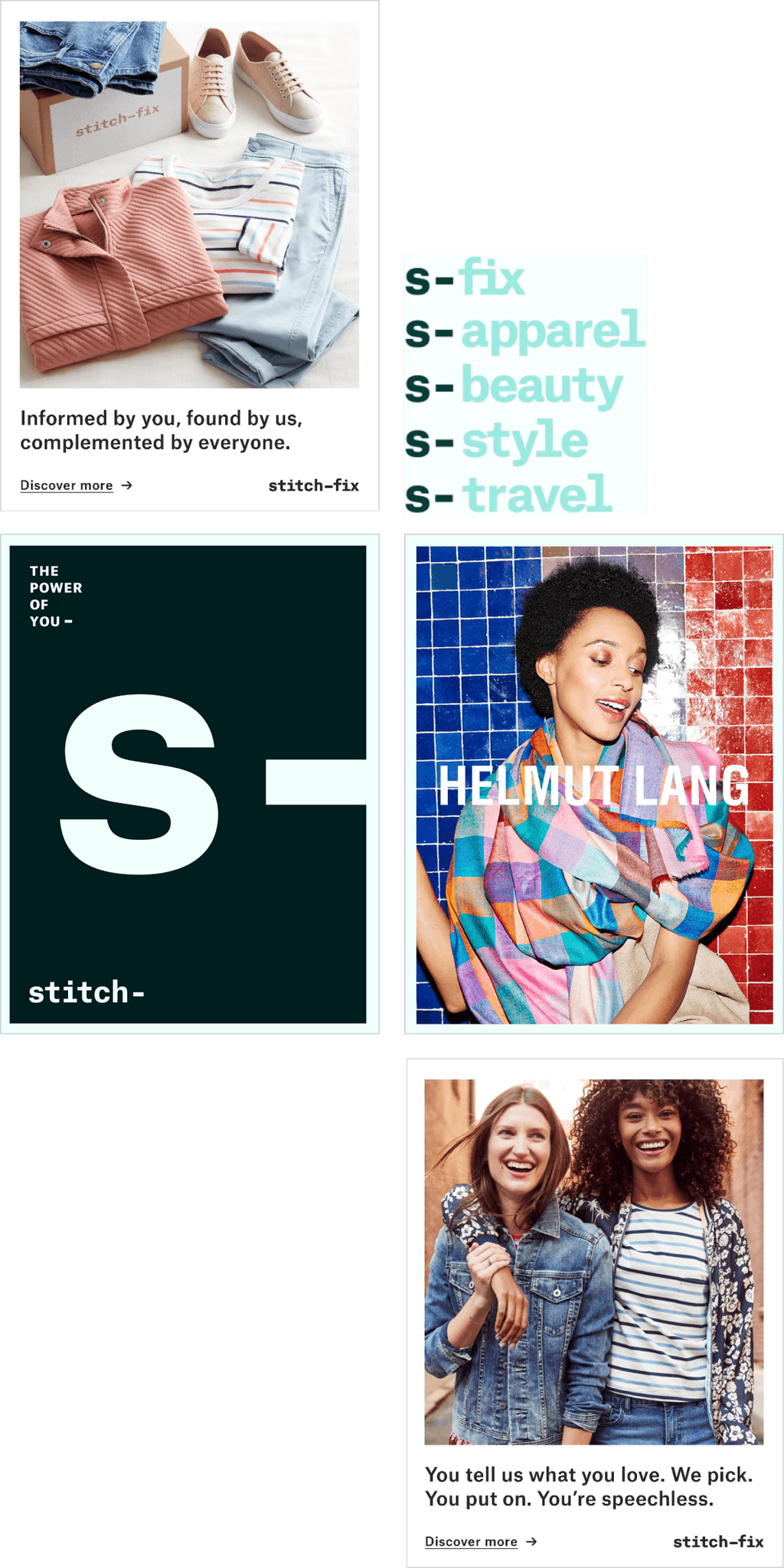
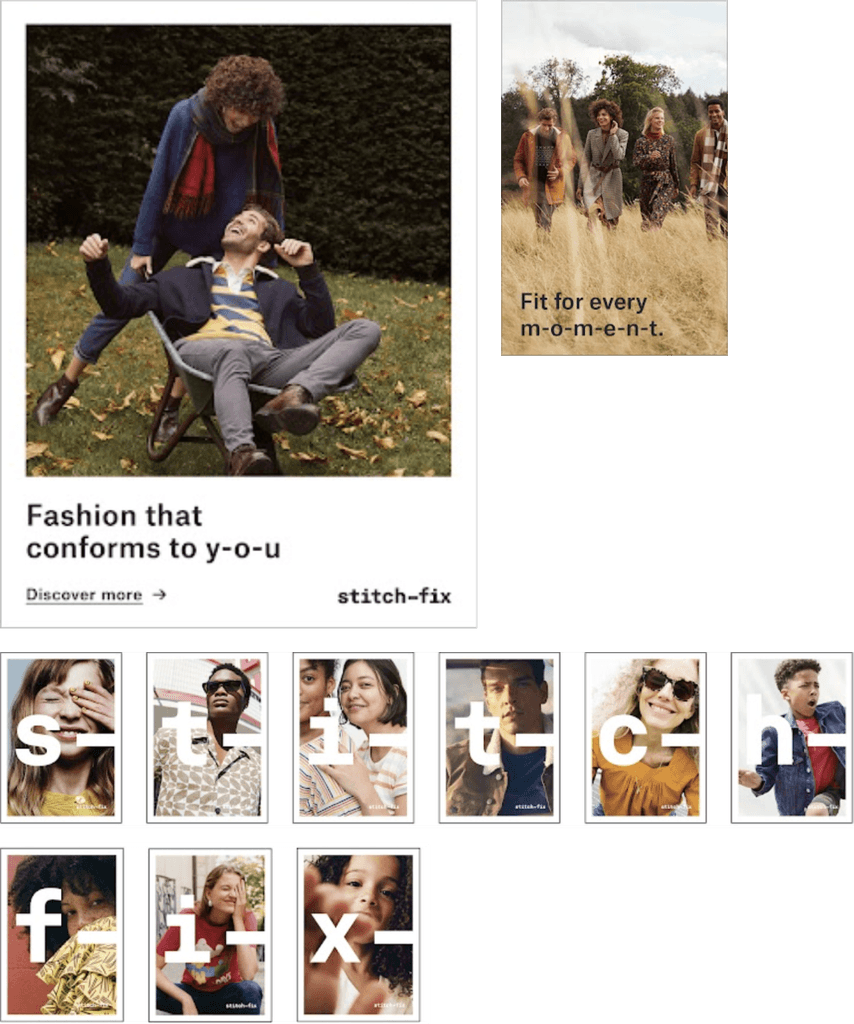
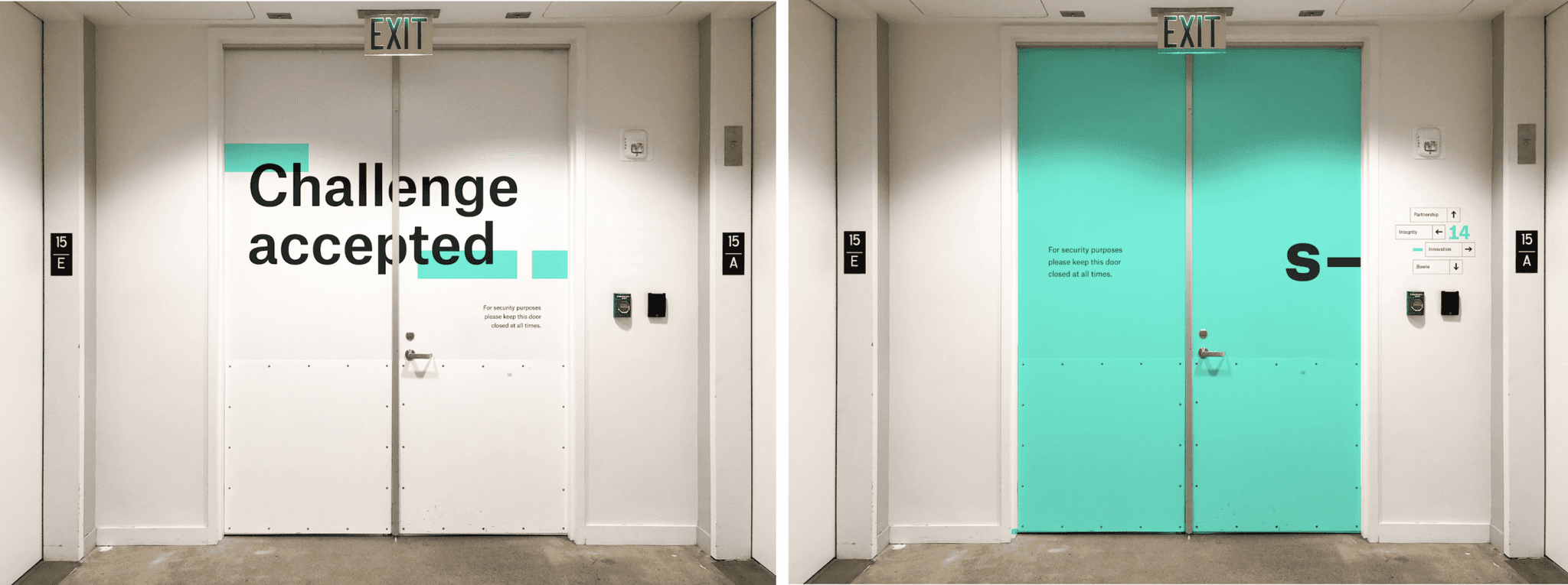
Then came the final direction, Magnetism—the most daring of them all. This was the territory that dared to take Stitch Fix into uncharted waters. It revolved around the idea of dynamic personalization, symbolized by magnetic poles that attract what suits you and repel what doesn’t. This wasn’t just about style; it was about building connections, about “stitching” together a broader personalization platform that could expand far beyond fashion. Magnetism wasn’t just a rebrand; it was the foundation for a whole new business initiative, aptly named “Stitch.”
the team

travelling fo(u)rth
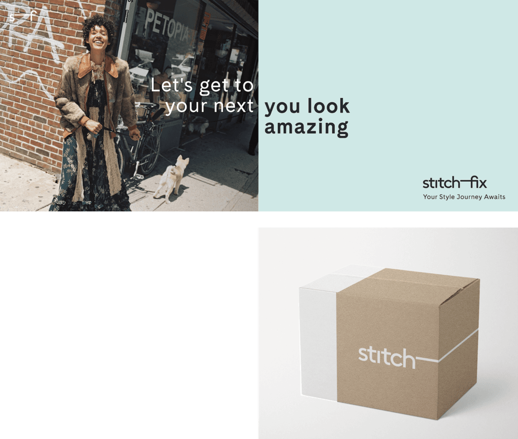
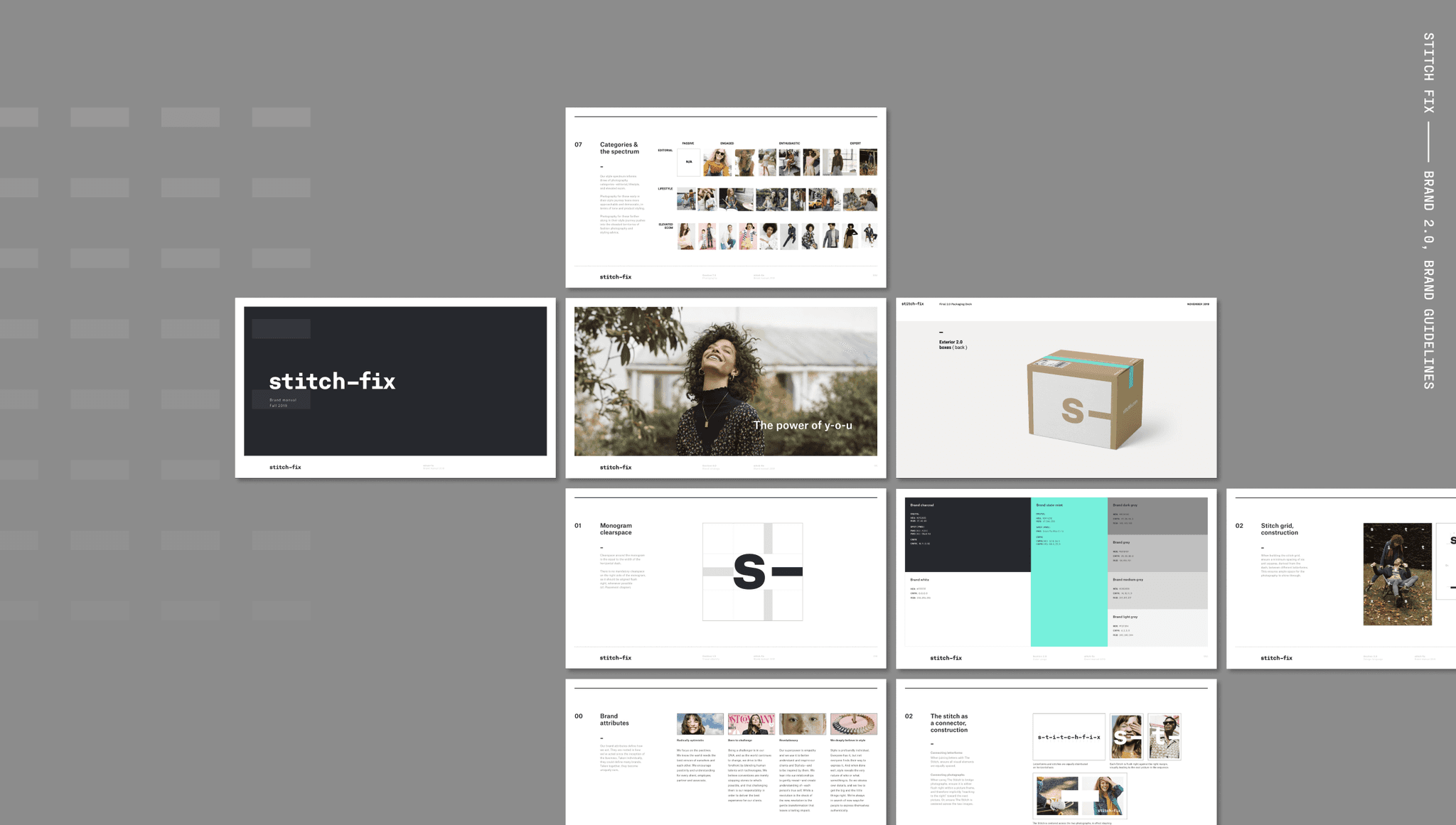
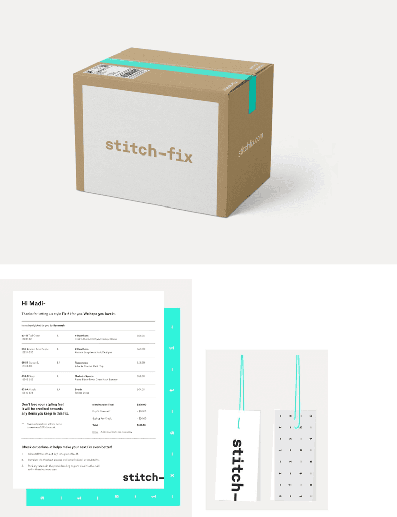
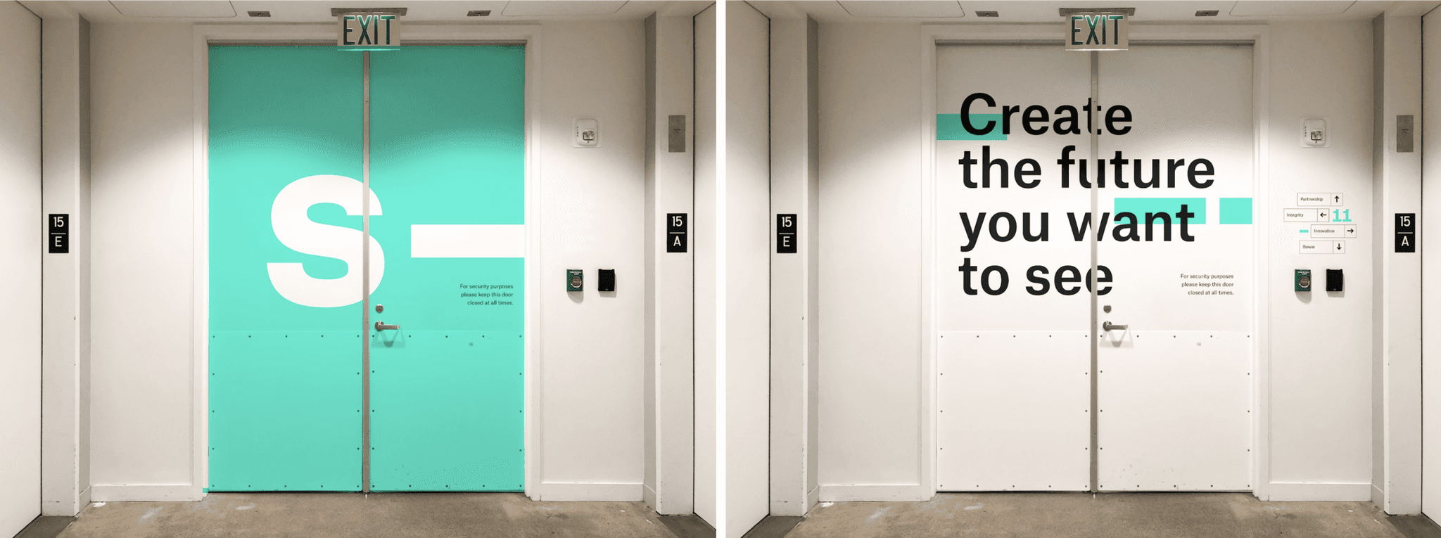
In the end, Magnetism won the day. It wasn’t just the boldness of the concept that captivated the C-suite; it was how seamlessly it aligned with the company’s strategic goals for expansion. What followed was a year-long rollout that saw the Stitch Fix of “today” transformed through the lens of Magnetism. My team and I delivered a completely new brand system—everything from visual identity and content strategy to voice, tone, and even the motion and packaging systems. Over 12 months, we redefined Stitch Fix, crafting a brand identity that was not only robust and comprehensive but also fearless and forward-looking, earning approval and accolades from the highest levels of the company.
the team
Unfortunately, fate had other plans. Just one week before the launch of our bold new rebrand, Stitch Fix hired a new President, and with that change in leadership, the project was put on hold indefinitely. Despite all the creativity, strategy, and countless hours poured into the initiative, the rebrand never saw the light of day. While it was a tough pill to swallow, the experience remains a testament to the power of creative vision and the resilience of a team that dared to push the boundaries, even if the world didn’t get to see the it.